Food is an integral part of our daily life. However, everyone’s attitude towards eating is different, this is especially noticeable lately: for some, food becomes a cult; food lovers post dozens of photos of their lunch or dinner, without noticing that they eat much more than their body needs. Others, on the contrary, strive to limit their food consumption to a minimum, emphasizing their independence from food. Proponents of proper nutrition count calories, vegetarians make sure that nothing of animal origin gets into their dishes... In general, food is now a special area of human life that cannot be ignored. Therefore, you should not be surprised at how much of it has become devoted to everything that can affect food intake. For example, color, or more precisely, its effect on appetite. You will learn from the article what color causes appetite in people. So let's get started.
How does appetite appear?
Appetite is a person's desire to eat. It is explained by a simple physiological reaction and is associated with a decrease in blood sugar levels. Chemoreceptors transmit a signal about a lack of glucose to the hypothalamus, then this signal goes to the cerebral cortex, from here thoughts are born that it would be nice to eat. At the same time, the organs of the gastrointestinal tract begin to actively work: salivation increases, gastric juice is produced, so the body prepares for eating. When hunger is satisfied and the blood glucose level is back to normal, the brain also receives a signal: “That’s enough.”
Appetite stimulating shades
Color stimulates or suppresses appetite. Tones that stimulate the desire to eat include the following:
- red;
- orange;
- yellow;
- green;
- turquoise;
- pink.
Psychology includes 2 areas that study the influence of shades on a person’s behavioral model: color therapy and color psychology. Using tone, you can control your eating habits and body weight. It is worth taking a closer look at how each shade affects the human psyche and what it is associated with on a subconscious level.
Red
Red is the most energetic and cheerful tone. Different shades have an exciting and stimulating effect. When a person looks at red objects, his heart rate increases, blood flow increases and breathing rate increases. The scarlet tint can even provoke an increase in blood pressure.
Since red stimulates brain activity, most people cannot stay in a room with walls decorated like this for a long time. Internal discomfort arises, the need to be in a calmer environment. Therefore, burgundy and scarlet tones are used to decorate interiors in dining rooms and bistros, where visitors are expected to quickly leave the establishment.
Red color stimulates appetite. Being in such a room, depression and bad mood recede into the background.
Orange
Orange color 1 is one of the most “edible”. The presence in a room decorated in such colors begins the active production of gastric juice. Warm lighting only enhances the perception. Properly selected lighting makes food more beautiful, which makes your appetite even stronger.
The orange tone promotes mental activity and increases the supply of oxygen to the brain. Being in such a kitchen, you don’t want to sleep at all, you feel cheerfulness and a surge of strength. Some studies have shown that orange helps people absorb calcium better.
Even yellow foods such as carrots, pumpkin, and oranges have a similar effect. It is difficult to refuse your favorite treat in a pleasant atmosphere.
Yellow
Yellow is the color of the sun, joy and light that surrounds a person. This color awakens the nervous system, promotes the activation of thinking, and promotes a deep feeling of satisfaction.
Eating in rooms decorated in yellow tones provides a good environment. People eat with appetite and communicate well at the same time.
Researchers have proven that the color yellow encourages logical thinking. Often business conversations over lunch are held in salons where the walls are decorated in yellow.
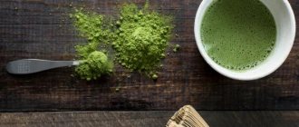
Green
The color green is directly associated with appetizing eating. Many families have kitchens in their apartments in these shades. The healthiest food is greens, some vegetables are also green.
This shade helps maintain proper nutrition. It does not reduce appetite in any way, but awakens the desire to eat healthy and nutritious dishes that will not have a negative effect on the body.
Psychologists say that many people associate the green hue with abundance. The green color of the walls in the kitchen will awaken the appetite, but not be irritating. After all, the grass, trees and many other things around us are of this tone, and this does not excite the nervous system and does not cause negative feelings.
Green tones can have different effects depending on the shade and other colors it is combined with. The more yellowish it contains, the more it will stimulate your appetite. Combination with blue will lead to muted feelings of hunger.
Turquoise
A turquoise tint will not help you maintain your diet. It is associated with feelings of lightness, joy and happiness. Actively stimulates appetite.
This color is often used to decorate restaurants and tableware. Even when the feeling of fullness has already arrived, it is difficult to resist and not eat another piece of the treat. Especially if it lies on a turquoise saucer.
Pink
Pink strongly provokes the development of appetite. If you want to lose weight by shedding a few extra pounds, you should beware of decorating the kitchen in this tone or visiting establishments where the interior is decorated in this way.
Pink tones stimulate the production of gastric juice and whet the appetite. If there is a child in the family who does not eat well, then with the help of color therapy you can solve the problem.
The effect of color on appetite
Many people already know the concept of color therapy. Psychologists use color treatment to combat stress, depression and other nervous disorders. Color can affect your appetite. Thus, researchers have identified colors that induce appetite. They are recommended to be used in the design of dining rooms and kitchens, and to buy dishes in these particular colors. There are also shades with a reverse effect.
You should remember the colors that cause hunger or, conversely, suppress the desire to eat, and take this into account when organizing the space where you usually eat, as well as when preparing dishes.
Shades that can reduce appetite
When extra pounds are not the result of a physiological illness, psychological methods come to the rescue. Saying affirmations (short phrases) for weight loss and studying the psychology of nutrition become a breath of fresh air for a woman. She pins all—and sometimes her last—hopes for finding harmony on such methods.
Think about what can provoke, awaken and improve your appetite? Is food really delicious, or just a trick of the mind? Conduct an experiment, arm yourself with our information and check the influence of the colors of the rainbow on your figure. Maybe the orange curtains in the kitchen are to blame?
Blue
This shade is associated with firmness and inflexibility. A person dining in an interior with a predominance of blue is either absolutely sure that he will eat every last crumb, or will not even allow himself to touch his fork. Therefore, if you adhere to the second position and want to suppress and discourage your desire to eat a lot, then feel free to bring accessories of this color into your apartment.
It is noted that blue dishes cannot excite and cause appetite; they take away some of the attractiveness of food and slow down metabolism.
Violet
Mysterious and inspiring. It is often considered mystical and therefore full of attraction. However, this works in everything except nutrition.
It is generally accepted that purple-hued natural products are not everyone's favorites. This color reduces appetite, causing a bad taste association.
Purple is considered the main color of feminism.
Brown
The duality of the shade is manifested in its effect on a person. You may remember that most coffee shops and pastry shops are decorated in brown tones. There are quiet and serious conversations. Along with this, for others it evokes not the most pleasant memories and is used to reduce the time spent in the kitchen.
A clear answer to the question “Can brown color affect appetite?” - No. Focus on your feelings.
Black
Not the most “appetizing” element of the rainbow. It is noteworthy that interest in food decreases, but dreams about it can arouse.
People associate the color black with danger, grief and destruction. And since in the past of the Russian people there were terrible wars, times of famine and depression, it can be assumed that, under certain factors, black is still able to increase and arouse interest in food. But there is no confirmed information on this shade.
Grey
"Tasteless" shade. This is usually what they call bland food. It cannot awaken and induce appetite, and it reduces the speed of metabolic processes. Due to its depressing influence, gray color is not used in catering areas. And this is just a reason to draw your attention to it.
Gray utensils have a calming effect, putting you in a quiet and unhurried mood. And at the same time it works to reduce the attractiveness of products.
Often used as a base color to add bright accents.
White
It cannot be called universal. It can stimulate and increase your appetite in your home, but at the same time completely suppress your friend’s desire to eat. This is due to the fact that, on the one hand, the white tint does not distract from the meal or food, on the other hand, it can put some pressure on the consciousness and psyche, correlating with immaculateness and purity. Here everyone chooses for themselves.
White food is considered more filling and nutritious.
How to increase interest in food?
Colors that stimulate appetite include warm, bright shades of red, yellow, and orange. Sky blue and turquoise also encourage us to eat something delicious. Perhaps you have even noticed that desserts are often served in turquoise dishes. It turns out that this is no coincidence - it is much more difficult to refuse a cake served on such a plate.
If you suffer from a lack of desire to eat, then remember the main colors that cause appetite. Red, yellow, orange, bright green, and turquoise awaken interest in food. Surround yourself with these shades and it will help solve your eating problem.
Colors that make you want to eat
Colors that stimulate the appetite are bright and instill cheerfulness. They speed up metabolism, evoke pleasant emotions and encourage physical activity, which makes you want to snack.
Red
These shades make a person stronger and more resilient. In such an environment, energy manifests itself; you want to re-tackle long-forgotten things and ideas. Red speeds up metabolism, warms, and invigorates. Since the body requires more energy, a subconscious desire arises to eat something extra.
Red color speeds up metabolism.
Orange
The color is similar in influence to red, but is perceived by many more positively. It is not associated with aggression and, on the contrary, evokes a peaceful attitude. Orange helps to negotiate and make new acquaintances. It improves hormonal levels, which indirectly promotes weight loss, but at the same time increases appetite.
Orange evokes a peaceful attitude.
Yellow
Of all the colors, yellow shades have the most powerful effect on the brain. They cause mental overexcitation, activate intellectual activity and give a charge of vigor. Color simultaneously improves mood, provokes a surge of energy and relaxes.
Yellow color affects the brain.
When there is an excess of yellow in the interior, due to its contradictory action, nervous breakdowns occur and exhaustion occurs.
Green
Like yellow, it calms, but at the same time speeds up metabolism, encourages active action and gives a charge of vigor. This color is recommended for people who are anxious and constantly exposed to physical, emotional and intellectual stress. However, those who want to lose weight should avoid using green shades in interior design. As a last resort, it is better to turn to cold or marshy tones.
Green color speeds up metabolism.
Turquoise
It is a combination of blue and green. It, like its components, calms, but at the same time makes a person optimistic and cheerful, and evokes a desire to act. Despite the fact that this is a cool shade, many perceive it as warm. This is due to the association with the sea. Thoughts of a warm beach, steady swaying waves and carefree relaxation stimulate your appetite.
Turquoise color makes a person optimistic.
Pink
This color evokes nostalgia. For many, it is associated with childhood, tenderness, and care. When you look at it, you feel a sense of safety and security, your mood improves, and you have a desire to snack on something tasty.
The color pink evokes nostalgia.
White dishes - etiquette or a thoughtful move?
Dishes are of great importance for controlling appetite. Its size, shape and, of course, color are important. According to etiquette, it is correct to serve food in white dishes. And although we usually do not classify white as a color that arouses appetite in people, choosing tableware of this color is really advantageous if your goal is to increase the desire to eat. Food looks more impressive against a contrasting background. The dish looks more aesthetically pleasing and, of course, more appetizing.
What color of dishes stimulates appetite?
The abundance of dishes in the modern world is sometimes surprising. It differs in purpose: there are plates for soup, for salad, dessert, in shape: square or figured mugs are no longer new to anyone, there is no need to talk about color variety. But how to choose exactly the one from which it will be most pleasant to eat? What color dishes stimulate your appetite?
A dish served on a bright red plate will be eaten with greater pleasure than food served on a dark green plate. This is because colors that evoke appetite, and we remind you that these are red, orange, yellow and other warm shades, are also relevant when choosing tableware. In addition, it is important to consider the contrast between the dishes and the dish for which they are intended. So, if black does not usually excite the desire to eat, then a black plate, if used correctly, will become an excellent device in your kitchen. For example, white rice on a black background looks much more impressive than on a standard white plate.
Appetite suppressing colors
Green is a natural color that symbolizes life, calms, and puts you in a contemplative mood. This color will relieve tension, increase vitality, and give a feeling of harmony, balance and tranquility. Plates in natural green shades, such as olive, will go well with the brown color of the wooden tabletop, which will help you feel natural harmony. On a green plate you can beautifully serve a salad with oranges or other orange-colored vegetables and fruits. You can add accents of light brown and other brown shades, such as walnut. Pasta with mushrooms and cream sauce will look great in a green bowl.
Blue and blue – these colors evoke a feeling of security. Use them if you feel excessive anxiety or are experiencing a serious loss, loss of strength, or if you are overly emotional. The color relaxes and calms. It is believed that if during experiences you cannot control your appetite, then the blue tint will help you calm down and be more conscious of what and how much you eat. On a blue table it is beautiful to serve fish, seafood, fruits and vegetables in white, beige and yellow colors.
Purple has a strong influence on all human senses; it is considered the color of soulfulness and inspiration. You should not overuse purple on the table, as it may create a feeling of apathy. Combining red and blue, it equally combines calm and movement. The most mystical of the entire palette, its high concentration can provoke deep withdrawal into oneself. As a daily serving, it is suitable for a very small number of people. Purple goes well with foods and dishes that are golden brown, pale yellow, light orange, and mint green.
Kitchen color
And yet, the main color that affects our appetite is the one in which the kitchen or dining room is decorated. The place where we eat food is very important for its perception. If upon entering a room you have a pleasant feeling of warmth and comfort, then most likely you will not refuse to have lunch in this room. As a rule, this feeling appears when we find ourselves in a bright room, the decoration of which uses more warm and bright colors that cause hunger. This applies to the color of walls, furniture, and decorative items.
If the design of your kitchen is made in cold and dark colors, then most likely you will not want to eat in such a room. Making a blue or gray kitchen means guaranteeing yourself to eat much less than usual. A great way to lose weight - ideal for those on a diet.
Colors that reduce appetite
Blue
But cool colors significantly reduce appetite. In this case, the most negative color is blue - the opposite of yellow.
In addition, appetite decreases under the influence of blue-green, violet and blue colors, since they are subconsciously associated with something poisonous, with something that should not be consumed.
For this reason, those who want to lose weight should eat in dishes decorated in cool colors - for example, blue or purple.
But you shouldn’t decorate the kitchen in such a color scheme, otherwise you will constantly feel depressed while in this room.
Design tips
Of course, you shouldn’t, having learned that yellow can increase appetite, use it wherever and whenever possible. Even if your kitchen is not decorated in an appetizing color, using some bright details will definitely help stimulate the desire to eat. They are not striking, but catch the eye. That is, it is not necessary to use all the colors that evoke appetite in the interior. It is enough to focus on one or more objects. Let it be a scarlet tablecloth or a bright green vase with sunflowers, even a yellow clock on the wall will attract attention; drawings, prints or all sorts of little things depicting products that make most people salivate will be especially relevant when decorating a dining room or kitchen flow. If the picture above the table shows a still life with bright juicy fruits: orange peaches, red strawberries, green apples, then requests for more will not keep you waiting.
What about white?
White tablecloths and white plates symbolize purity and sophistication. White is a status color, coldly neutral, the color of “haute” cuisine, spied on by restaurateurs with Michelin stars. White in the interior and design does not distract, emphasizes and concentrates attention on the item for sale.
White is for those who do not flirt with visitors - it is for those who come to a cafe or restaurant, first of all, for the sake of food.
About the combination
The combination of colors also matters. When you look at red-green walls you won’t feel like eating, although both of these colors can have a beneficial effect on our appetite. The thing is that these two colors contradict each other, look unaesthetic and cause dissonance in our minds, a person begins to feel psychological discomfort. And in this state, will we really think about a tasty dish?
Therefore, it is not enough to know which color causes appetite. It is important to use shades together correctly and not allow two or more aggressive, bright colors in the same room. In general, you should be careful with bright colors. They can play a cruel joke and, instead of increasing appetite, cause an uncomfortable feeling of pressure. So know when to stop, because not only your eating behavior, but also that of your household members, largely depends on the design of the kitchen or dining room.
Color diet: weight correction using color
American scientists decided to apply knowledge about flowers in nutrition. They developed a special diet, the effect of which is based on the consumption of foods of a certain color. It was called the “ color or color diet .” The developers guarantee the loss of ten kilograms after a month of diet.
The essence of the color diet is very simple - every day of the week you need to eat foods of only one specific color. Products of other colors are no longer allowed on this day. Experts in color psychology believe that mixing different colors on a plate confuses our body. A colored diet helps to avoid this effect and will allow you to fully gain the necessary energy.
Thanks to a color diet, a person is not irritated by the variety of colors while eating; he is in a state of relaxation. This promotes better absorption of food. In turn, this leads to excess weight loss and overall health of the body.
It should be noted that science has not yet confirmed this method of nutrition. But we can say with confidence that the colored diet is completely harmless. In addition, it does not limit a person’s amount of food. You don't need to count calories either. You can follow this diet for the rest of your life. In addition, a person has to control what he eats. And this is always useful.
Colorful food
Since ancient times, people have used food coloring to make food more attractive in appearance. In ancient times, dishes were colored with the juice of berries and vegetables. Nowadays, in order to give food a bright color, you don’t have to be so clever - the food industry has adopted a variety of dyes, both natural and artificial. The color palette of modern food dyes is very diverse, because brightly colored food looks much more appetizing. Multi-colored dishes are especially popular among children. So, if your child has problems with appetite, try, for example, cooking multi-colored pasta for him instead of plain pasta and evaluate the result. Eating these will be much more interesting for your child.
Of course, colored food attracts not only children, but also adults. Even the simplest dish will look much more impressive if you add a couple of drops of dye to it. This is especially true when preparing a festive table. Without a doubt, your culinary skills will be appreciated an order of magnitude higher if the food you prepare is not only tasty, but also beautiful.
About food coloring. Choose natural
Manufacturers have also adopted this approach. There is no doubt that when choosing the same cake, the hand will reach for a brighter copy. But here you need to focus not only on the bright color that evokes appetite, but on the nature of this or that dye. It is better if it is natural or at least identical to natural, since an allergic reaction may occur to artificial additives, and children are especially susceptible to it. Natural dyes such as curcumin, a yellow-orange dye, will not harm the body and at the same time will color the food in the desired color; alkanine and carnine will give the dish a red tint; green is achieved with the help of chlorophylls; they are extracted from edible plants: spinach, nettles, broccoli . Do not be alarmed if you find carotenes, lycopene, annatto extract, and anthocyanins in the product.
How to use in nutrition
The properties of rainbow shades are often used to organize menus:
- Red-colored foods stimulate digestion and activity;
- orange color in food causes an additional surge of energy and improves metabolism;
- yellow food increases the speed of thought processes, removes old deposits and toxins;
- green products are best used to stabilize the emotional state;
- blue food is especially good for weight loss and prevents aging;
- food with a blue tint helps strengthen capillaries;
- purple products adjust the correct supply of oxygen to the lungs and stimulate mental activity.
What about in restaurants?
It would be strange if all the listed factors that can arouse the desire to eat were ignored by restaurateurs. In modern cafes, everything is thought out to the smallest detail so that the guest wants to eat as much as possible and so that his meal gives him maximum pleasure, because then he will come back again and again. Whatever the style of the restaurant, its specialization or prestige, there are general rules of organization that all owners try to adhere to. The same applies to the color design of the place. Often in restaurants you can notice the colors that stimulate your appetite. Red napkins, orange curtains, yellow cushions on chairs - all these design solutions are well thought out from the point of view of stimulating the desire to eat. It is also important for restaurateurs that all visitors are happy, because of this they give preference to neutral colors, ones that rarely cause rejection. Caramel beige, peach pink - even the names of these colors sound just as appetizing! If you don’t know how to decorate your dining room, then stop by the nearest restaurant, pay attention to its decor and adopt a couple of design solutions.
Self-hypnosis or physiology?
Why is a person so susceptible to the influence of color? Is this a consequence of stereotypes that have developed in society or is it a given conditioned by physiology? How do colors stimulate appetite? Of course, the majority opinion that some colors are “appetizing” and others are not has weight in determining how a given shade affects one’s own appetite. However, not all so simple.
It turns out that a biological factor also plays a role here. Orange color makes the brain work more actively, which is why a person begins to feel hungry. And red can increase blood pressure, excite the nervous system and, accordingly, cause appetite. It’s not for nothing that scarlet is considered the color of passion and desire. Green color is a shade associated with benefits and health, so what is green is good for the body. Well, yellow is simply the color of joy and optimism.
Choose your favorite colors, because the main thing is that you feel comfortable in your kitchen, regardless of whether you want to increase or decrease your appetite.
We whet the appetite
Red - stimulates appetite. Chinese food restaurants prefer to use red in their interior design. The reason, I believe, is not at all in the national tradition and eastern love for red. Many fast food chains use red packaging for fast food products for this very reason.
On the other hand, most people feel uncomfortable staying for a long time in an interior dominated by red. Selling goods and forcing the visitor to vacate the table quickly is another task of the “red” bistro. It is from this property of red that the cake is decorated with a cherry or strawberry on top.
To make the salad tastier, decorate it with a slice of red bell pepper on top.
On a red plate, a portion of food seems both more attractive and too small - you are constantly tempted to add more food. Orange is a “close relative” of red and is associated with energy and strength. Color reduces overall fatigue and brings a feeling of comfort and hunger. It's a good color to stimulate the appetite, but it's easier on the mind than red.
The mind perceives orange foods as sweeter; when they see them, the composition of saliva and gastric juice changes. HoReCa, aimed at the evening business clientele, is your color. Products appear more attractive in warm orange-red lighting. Marketers of large grocery supermarkets know about this; raw meat, tomatoes, and fruits in which are often highlighted. Yes, if your establishment is located in a romantic place and is often visited by couples in love, orange is associated with sexual activity. Let there be orange slices or small orange flowers in your interior and on the tables of your guests. I think that's generous - excited customers will be regular guests in your establishment.
Yellow is a color associated with feelings of happiness and cheerfulness. Yellow, and marketing specialists know this, is the color of communication. That is why this color is so loved by youth cafes and all kinds of fast food. Perhaps the idea of actively using it in the interior and packaging is to encourage visitors to communicate more. Designers recommend using optimistic yellow tones when choosing wallpaper or furniture for the kitchen.
They not only awaken a healthy appetite, but also inspire a feeling of joy and security, which helps food be better absorbed. Just be careful, the yellow color, as much as it awakens the appetite, also creates a feeling of quick satiety.
Therefore, there are many products on sale from the snack segment that have packaging designs with an active yellow color - the brain associates quick satiation with the color yellow. Sometimes in HoReCa you can find recommendations to use yellow first courses, and yellow plates only for first courses.
Green is the color of nature and has a relaxing and calming effect on the mind and body as a whole. It doesn't have the same effect as red or orange. However, for some people, eating healthy is highly desirable and stimulating. For these people, green will be a color favorable to appetite. Therefore, a special menu or special products from the general menu should be highlighted with this color, positioning them as natural.
Please note that the more yellow there is in green, the more it will stimulate your appetite. Turquoise – improves mood and can whet the appetite no worse than orange.
Beige and brown are the colors of stability, natural, earth, wood. Marketers know that, on the one hand, these colors have a calming effect, and on the other hand, they do not suppress appetite. That is why the interiors of “expensive” establishments are painted in these colors. A dark wood shade in the interior, for example, can give the room a luxurious look.
These colors are also very popular on the table: meat, bread, beans - proteins and carbohydrates necessary for a healthy diet. Bread, by the way, is best served on dishes that are cream, beige or brown.